
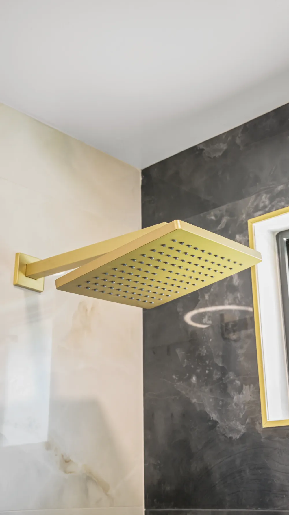
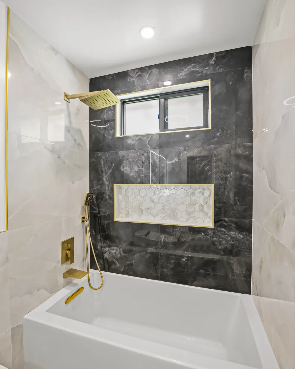
This Archer Street bathroom leans into contrast — a charcoal marble-look wall, warm brushed gold throughout, and a shimmering mosaic niche that keeps the dark expanse from reading as flat.
Why dark tile and warm metal work together
Dark stone-look tile and brushed gold is one of the more reliable pairings in bathroom design, and the reason is simple: they solve each other's weaknesses.
A large field of charcoal tile is dramatic, but on its own it can feel cold and heavy — grey and black veining reads blue-ish under most bathroom lighting. Warm metal cuts directly against that. Brushed gold is a yellow-warm finish, so every fixture and trim line becomes a point of warmth against the cool stone.
The contrast also does something practical. Against a pale wall, a gold fixture tends to disappear. Against charcoal, the same fixture reads as a deliberate object — the shower head, the valve, the handheld all become part of the composition rather than hardware you stopped noticing.
Note the finish specifically: brushed, not polished. Polished brass throws hard highlights and shows every fingerprint. A brushed surface scatters light softly, which is what keeps this from tipping into showy.
The two-tone move
The detail that makes this room work is one the photographs almost hide: only the wet wall is dark. The flanking walls are a warm ivory marble-look tile.
Had all four surfaces gone charcoal, the room would close in — dark tile absorbs light, and a small bathroom wrapped in it feels like a cave regardless of how good the fixtures are. Concentrating the dark tile on a single feature wall gets the drama while the lighter surrounding tile keeps the space bright and bounces light back.
It is a useful principle well beyond this bathroom: when you want a bold material, give it one plane rather than every plane.
The niche as a design element
A recessed niche is usually treated as pure storage — a hole in the tile for shampoo. Here it is doing real design work.
It is lined in pearlescent hexagon mosaic, which brings three things the charcoal field cannot supply on its own: texture, from the faceted geometry of the hexagons; shimmer, from the pearlescent glaze catching light at different angles; and a break in scale, since small mosaic against large-format tile gives the eye somewhere to rest.
The gold trim framing the opening is what turns it from an insert into a feature. Without the frame, the mosaic would read as an interruption; with it, the niche looks intentional and finished, and it ties back to every other gold element in the room.
Why a lined niche beats plain shelving
- It is recessed, so nothing projects into a space where you are moving around wet
- Nothing collects standing water the way an applied shelf can
- It gives you a place to introduce a second material without committing a whole wall to it
- Framed edges hide the tile cuts, which is where a rushed job usually shows
The trim lines
Look at the edges where tile meets tile and tile meets window. Each carries a slim gold trim profile.
This is the detail that most separates custom work from a standard tile job. Raw tile edges have to be resolved somehow — bullnose, a mitered corner, a trim profile, or caulk. Metal trim gives a crisp line, protects the vulnerable edge, and here provides a repeating thread of gold that pulls the composition together.
It is a small specification with an outsized effect, and one that has to be decided before tiling starts rather than after.
Frosted glass at the window
A window inside a wet area is a genuine asset. Natural light does more for a bathroom than any fixture, and it makes a dark tile scheme viable that would otherwise feel gloomy.
The obvious problem is privacy, and obscured or frosted glazing resolves it cleanly — light passes through, sightlines do not. It is a far better answer than covering the window, which surrenders the daylight, or leaving it clear and never opening the blind.
The window here is trimmed in the same gold, so the opening reads as part of the design rather than something the tile had to work around.
One thing worth noticing
This is a tub and shower combination, not a walk-in. That matters, because bold design is often assumed to require a large room and a dedicated shower enclosure.
It does not. Everything that gives this bathroom its character — the feature wall, the mixed-material niche, the consistent metal finish, the trim discipline — applies just as well to a standard alcove tub. The design comes from the decisions, not the footprint.
On warm metals generally
Brass and gold tones have been ascendant in bathroom design for several years now, after a long stretch where chrome and brushed nickel were close to default.
If you are weighing it, the practical considerations matter as much as the look. Brushed finishes hide water spots better than polished ones. Living finishes are designed to patina over time, while coated finishes are meant to stay as installed — worth knowing which you are buying. And keeping one metal consistent through a room reads far more deliberate than mixing several.
If you are drawn to this look: the decisions that carry it — which wall goes dark, what lines the niche, which trim profile finishes the edges — all have to be made before tile is set. They are difficult to introduce once the walls are finished.